How to create a Cutout Text Effect using CSS
Make money for being or staying online/internet.
You will get a $50 starting gift when you join using this code: Exode4LKrbujm1z and link:: GET THE OFFER NOW!!
With CSS you can create a lot of cool stuff on your websites and today before you leave the site, you will leave with this new easy trick.
In this simple post I will share with you the source code used in the tutorial below.
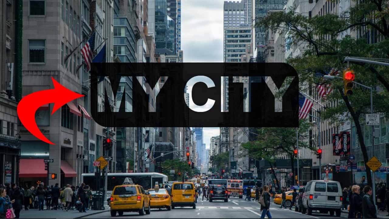
What is a cutout effect?
This is a see-through text that appears cut out on top of a background image.
Tutorial
HTML
This is the markup I used for this tutorial, but you can target as many elements as possible. The choice is yours.
<h1 class="city">my city</h1>
CSS
The mix-blend-mode property makes it possible to add the cutout text to the image.
NOTE::The mentioned property above is not supported in Internet Explorer or Edge
body{
  display: flex;
  flex-direction: column;
  align-items: center;
  justify-content: center;
  background-image:url('city3.jpg'); /*Replace this with your image path*/
  background-repeat: no-repeat;
  background-size: cover;
  background-position: center center;
}

.city{
  background-color:rgba(0,0,0,.9);
  border-radius:0 50px 0 50px;
  color:#fff;
  font-size:140px;
  font-family: Arial, Helvetica, sans-serif;
  padding:10px;
  text-transform: uppercase;
  mix-blend-mode: multiply; /*Makes the magic/effect happen*/
}
For free stock images visit: http://pexels.com/
Save up to 80% with this Domain & Shared Hosting package deal! 80% OFF - GET OFFER NOW
Related Post(s)
» How to create a Fullscreen Background Video(Source Code)
» Creating A Pure CSS Preloader - Source Code
» How to use the CSS Negation and Language Selectors.
» Overriding The Default Text Selection Color With CSS
» Learn how to create responsive images with CSS
collections_bookmark Category :: Cssdate_range Published :: 3 years ago At: 01:15 AM
event_note Detailed Date :: Jul 11th, 2020
person Writer :: Code

